-
HerbShire is an indoor hydroponic farm that grows highly nutritious fresh hydroponic veggies without using any soil or pesticides. These greens use 80% less water compares to traditional farming, and are harvested right after your order. The brand’s core purpose revolves around a healthier planet and a healthier community and the brand’s main aim is to deliver ‘Supergreens for the Evergreen you!’
-
Helmed by a team of young entrepreneurs, HerbShire yearned to solve three challenges through their branding & visual identity:
1.) First - To normalize healthy eating in a way that it becomes a part of an individual’s everyday diet.
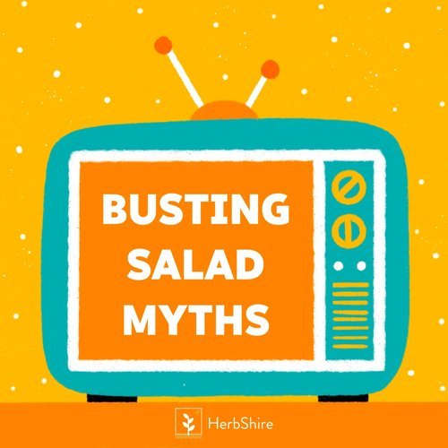
2.) Second - To negate the myth that says organic /healthy food is always costly and is only consumed by the elite.3.) Third - To educate the audience about vertical farming, and convince them that this method does not use any abnormal techniques, but is in fact cleaner & healthier than organic greens too.
-
Addressing the aforementioned brief, we identified a few gaps during our research process, before drafting a brand positioning strategy.
1.) We realised that HerbShire used the term ‘Exotic Greens’ extensively during their marketing communications. And using the word ‘Exotic’ made the product sound like its fit for only occasional consumption rather than an everyday consumption.
2.) Most players in the market including HerbShire were focussing on the novelty of the hydroponic technology, and had no differentiating factor between them. Hence developing a brand narrative and tone of voice for HerbShire was a must.
3.) We decided to build on the word ‘Evergreen’ and placed emphasis on Evergreen Recipes, Evergreen Personalities, Evergreen Exercises and an Evergreen community. The brand’s tagline - Supergreen for the Evergreen you was also derived from this concept.
4.) Rather than focussing on a clean, subtle visual identity, we wanted to communicate the fresh energy of Hydroponic Farming through a fun, young and contemporary brand identity.
PROJECT YEAR: 2021 | BRAND POSITIONING | BRAND STORY | PACKAGING & COLLATERALS DESIGN | PRODUCT NOMENCLATURE | SOCIAL MEDIA | CREATIVE DIRECTIONCREATIVE DIRECTION

-
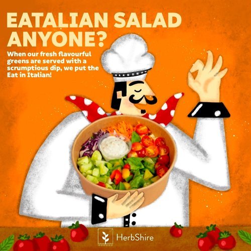
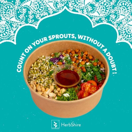
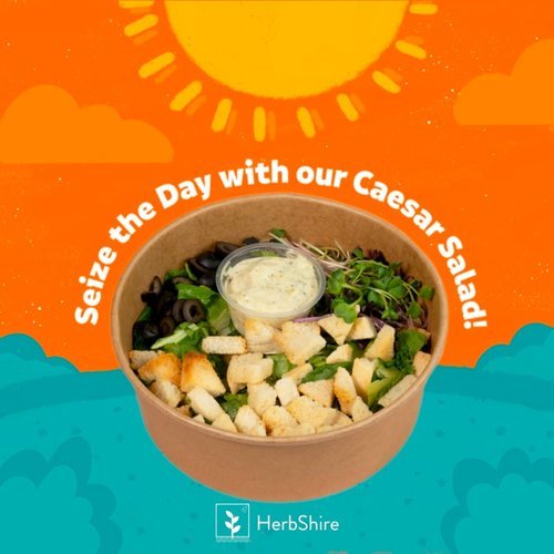
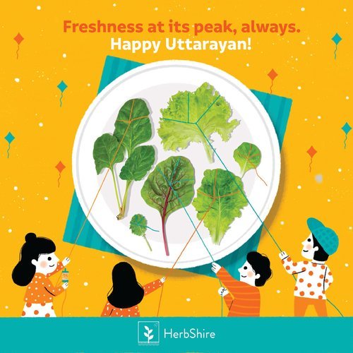
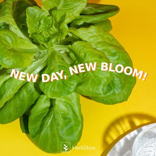
As a young new-age hydroponic brand, our primary visual cues for HerbShire’s creative direction were - Fresh, Healthy, Clean & Mouthwatering. With bold and beautiful visuals, HerbShire’s imagery focussed on vibrant colour palettes, clean presentation & crisp veggies to visually translate the freshness of Hydroponic greens.
Scope of work: Creative Direction
*While the creative direction & visualisation was in our scope, the Photography wasn’t in our scope and was taken care of by the client’s photography team.


PACKAGING DESIGN


-
For HerbShire’s visual identity we went for a clean, to the point, copy-centric approach, combined with the brand’s fresh colour scheme - Aqua & White. With a conversational tone of voice, the visual identity consisted of elements that would introduce the concept of healthy eating in a fun way for the younger demographic & at the same time appeal to the older demographic too, convincing them to consume greens in a new format. The fun & upbeat product nomenclature was also developed keeping the brand tone in mind.
SOCIAL MEDIA